Project Overview:
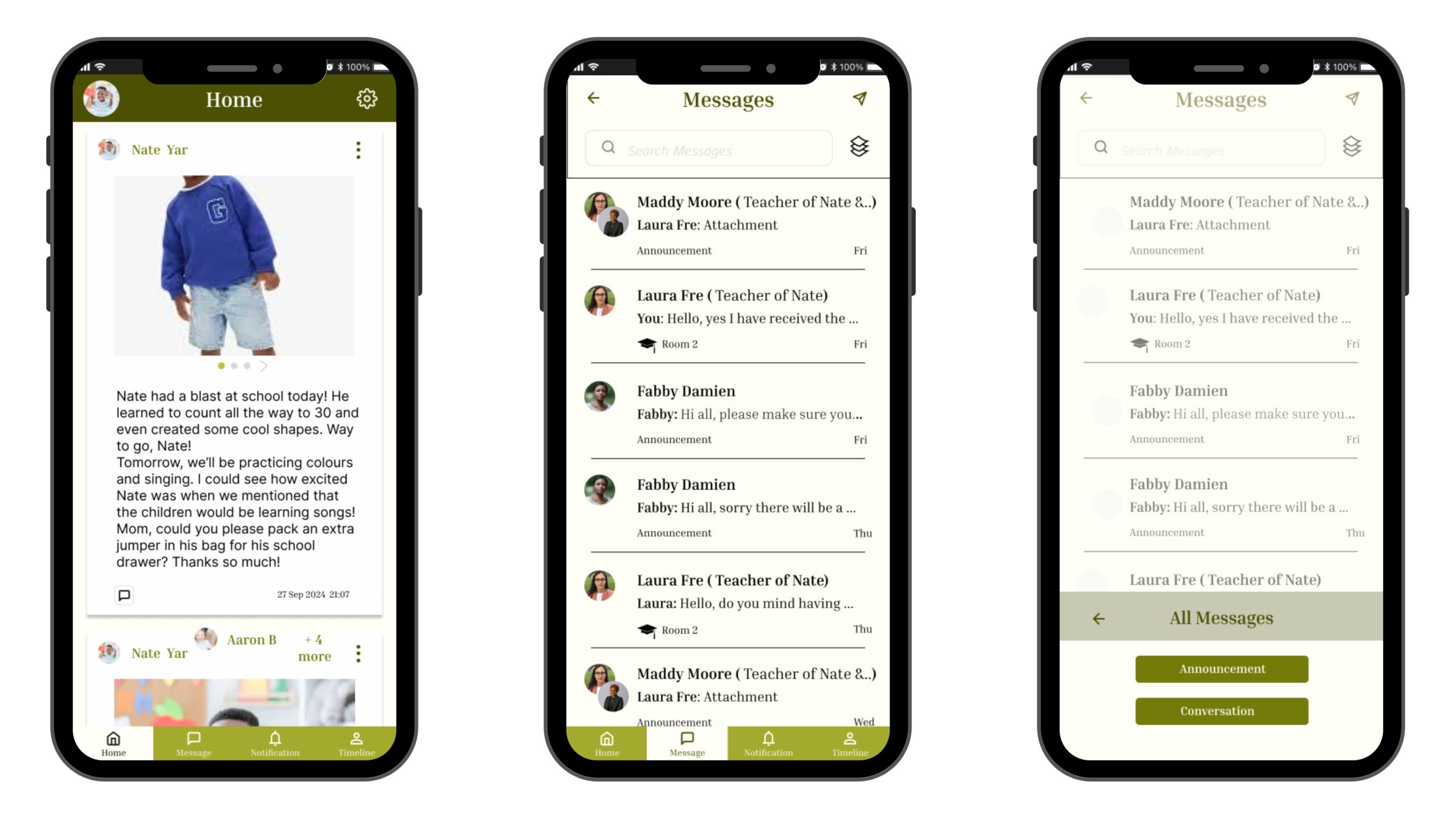
I designed an educational app that connects teachers, students, and families, leveraging emotional and cognitive psychology principles such as empathy in design and cognitive load reduction. The app was designed to foster communication and collaboration between these groups, ensuring users feel comfortable, confident, and engaged.
The app provides real-time insights into children’s learning, both at home and in school. Teachers can share regular updates, while parents can upload moments from home that they believe are important for teachers to see. Additionally, families can easily manage multiple children with a clear timeline for each child. To simplify communication, the app also allows parents to report absences through a straightforward messaging feature. The project took three days to design, emphasizing user-friendly and inclusive features.
Design Process:
- Empathy in Design:
- By integrating emotional psychology principles, the app ensures that users (parents, teachers, and students) feel valued and heard. Features like personalized updates and visual representations of children’s achievements aim to build emotional connections and trust between users.
- The user interface was intentionally designed to evoke warmth and positivity, reflecting the nurturing nature of education.
- Cognitive Load Reduction:
- Features were structured to reduce complexity, ensuring that users—regardless of technical expertise—could navigate the app seamlessly. For example, managing multiple children’s timelines or sending quick absence messages was made simple and intuitive through clear layouts and efficient functionality.
- Feedback Integration:
- I gathered insights from potential users, including parents and teachers, to refine the app. This helped align the design with their expectations, ensuring accessibility and ease of use.

Branding Elements:
The branding was a vital aspect of this project, reinforcing the app’s focus on trust, collaboration, and user engagement.
- Color Scheme:
- The primary colour of the educational app is an earthy green tone, chosen for its calming and trustworthy qualities. Green also represents growth and learning, aligning with the educational theme.
- Neutral background colors complement the green, ensuring the interface remains clean and non-distracting. This color palette reflects professionalism while being inviting and inclusive.
- Typography:
- A clean and modern sans-serif font was used, prioritizing readability for users of all ages. Larger headings distinguish key information, while smaller text provides supporting details. Consistent typography ensures clarity and reinforces the app’s approachable tone.
- Iconography:
- Simple, intuitive icons guide users through navigation. The icons represent universal symbols, reducing the need for textual explanations and catering to diverse literacy levels.
- Imagery:
- Including avatars and personalized visuals, such as a child’s update on the home screen, helps humanize the interface. This imagery fosters a sense of connection between families and educators.
- Visual Hierarchy:
- Key elements such as names, updates, and navigation tabs are given visual prominence to direct users’ attention efficiently. Secondary elements, like message previews, are designed subtly to avoid overwhelming users.
- Emotional Tone:
- The overall branding communicates warmth, collaboration, and inclusivity. These elements were intentionally designed to resonate with educators and families, emphasizing the importance of trust and shared responsibility.

The educational App’s key features:
- Personalized Updates:
- Teachers can share regular updates on children’s progress, while parents can contribute moments from home to keep educators informed.
- Clear Child Timelines:
- Each child has an individual timeline, making it easy for families to track their academic and personal milestones.
- Simplified Communication:
- A streamlined messaging feature allows parents to report absences or ask questions effortlessly.
- Scalable Design:
- The app accommodates families with multiple children, offering a structured yet flexible design to manage information intuitively.
Outcomes of the educational app:
The final design successfully balances cognitive load reduction, emotional connection, and usability. By integrating thoughtful branding, the app offers a seamless user experience that reflects its purpose of fostering collaboration between families and educators.
The branding—focused on warmth, trust, and professionalism—not only enhances the app’s visual appeal but also aligns with its mission of simplifying communication and creating a supportive educational environment.
If you love this blog, kindly share the posts with your friends and loved ones. It will mean a lot to me to know your thoughts in the comments. Love, Grace


