Overview
Revolut, a popular digital banking platform, has built a reputation for offering a variety of financial services through a user-friendly app. However, while the app caters to a wide range of users, its design can be challenging for individuals with accessibility needs. This case study focuses on redesigning the Revolut app to make it more accessible by focusing on key areas: a name change to a more inclusive tab, simplified content for users with cognitive disabilities, voice command integration, enhanced security features, and minor icon adjustments.
Design Problem
The existing Revolut app, while highly functional, lacks certain accessibility features that could significantly benefit users with visual, auditory, and cognitive impairments. The app’s “Appearance” tab, for example, primarily caters to aesthetic adjustments, without considering broader accessibility needs. Moreover, some users, especially those with cognitive or visual impairments, find the interface overly complex due to a dense layout, heavy use of text, and limited options for alternative navigation.

Redesign Goals
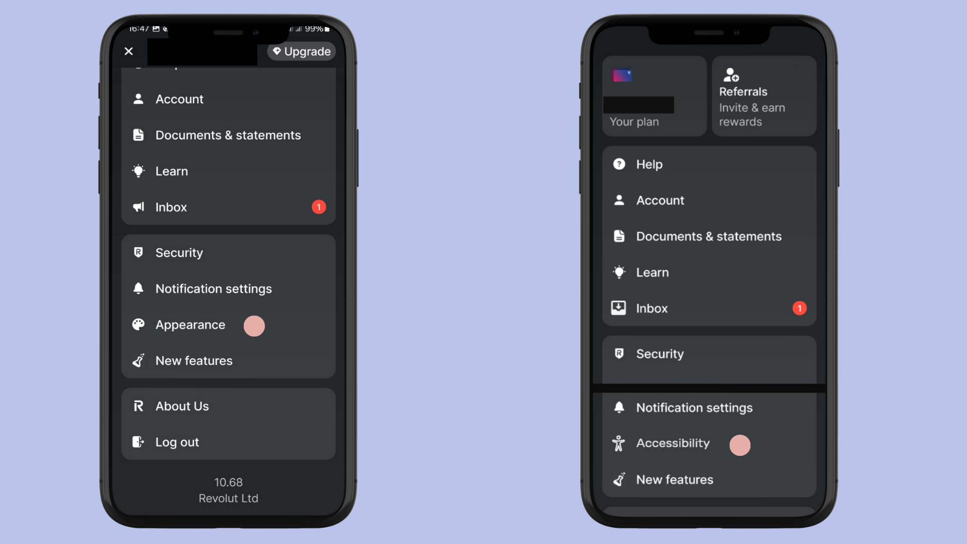
- Change the “Appearance” Tab to “Accessibility” Tab: The word “Appearance” implies that the feature is only useful for those with visual needs. In the redesign, renaming it to “Accessibility” ensures that the tab is more inclusive and better reflects its purpose for a broader range of disabilities.
- Focus Mode: Introduce a Focus Mode that reduces unnecessary distractions by simplifying the app’s interface. This mode would eliminate superfluous text and icons, showing only the most essential items and icons to assist users who need a more streamlined, less cluttered interface.
- Voice Command Integration: For users who are visually impaired, integrating voice commands into the app will allow users to navigate through the app, perform transactions, and interact with essential features using voice alone.
- Hearing Enhancements: Implement hearing enhancements that allow users with hearing impairments to access critical auditory information, such as transaction notifications and alerts, through vibrations, visual cues, and text-based updates.
- Expanded Security Features: The current sign-in options are limited to biometrics (fingerprints) and Google sign-in. For improved inclusivity, adding Voice Recognition and face Recognition as alternative sign-in methods will cater to individuals who might have difficulty with traditional biometric methods.
- Improved Iconography for Inbox: While the existing icon for the “Inbox” is commonly used, it does not clearly convey its intended purpose. Based on Jakob Nielsen’s usability heuristics, I redesigned the icon to make it more intuitive. I replaced the current icon with a more conventional envelope icon, which users associate with “Inbox” across various platforms, ensuring greater clarity.

Process
1. Accessibility Tab
The “Appearance” tab was renamed to “Accessibility” to encompass a wider range of needs. This tab now serves as the central hub for users with various disabilities. It contains the following key features:
- Focus Mode: By enabling Focus Mode, users can simplify the app’s layout. Text-heavy screens are replaced with larger icons and minimal words, making the interface easier to navigate for those with cognitive impairments.
- Voice Command: A button in the Accessibility tab enables voice navigation. Users can give commands such as “Check balance” or “Send money” without having to interact with the screen directly. This feature supports visually impaired users, allowing them to control the app hands-free.
- Hearing Enhancements: This option allows users with hearing impairments to adjust the app’s notification settings. Notifications are delivered through vibrations, visual cues, and detailed text alerts, making information accessible without relying on sound.

2. Security Tab Enhancements
The existing sign-in options were limited to Biometrics and Google Sign-In. In the redesign, I introduced an additional security option:
- Voice Recognition: Voice recognition technology was incorporated as an alternative login method. This provides an option for individuals who might find it challenging to use face recognition due to physical limitations or privacy concerns. Users can now securely sign in using a unique voice pattern, adding an extra layer of flexibility and accessibility.
- Face Recognition: I added this as an alternative sign-in method to enhance the app’s security and inclusivity. While Revolut already offered biometric sign-in via fingerprints, I expanded this option by emphasizing its role in providing a more seamless and secure experience for users who might find other methods, like fingerprint scanning, challenging or inconvenient. By integrating face recognition, I made it easier for users, including those with physical disabilities or specific preferences, to securely access their accounts. This feature not only supports a broader range of users but also provides a more flexible and secure authentication process, ensuring that Revolut remains accessible to all.

3. Icon Redesign for Inbox
The existing icon for the “Inbox” was not immediately intuitive. According to Jakob Nielsen’s heuristics, users expect certain icons to reflect their function clearly. By replacing the icon that is closely related to ‘announcement’ with a more conventional Envelope Icon—the universally recognized symbol for an inbox—I made it easier for users to identify the feature quickly. This small but significant change helps enhance usability, particularly for new or less experienced users.
Results
The redesigned app now caters more effectively to users with diverse accessibility needs, resulting in:
- Improved User Experience: The Focus Mode and voice command options provide a more streamlined and accessible experience for users with visual and cognitive impairments.
- Increased Security: The addition of voice recognition for sign-in ensures that users who are unable to use biometrics have an equally secure method to access their accounts.
- Enhanced Clarity: The updated iconography improves the clarity of the app’s features, helping users quickly navigate to important sections like the Inbox.
Conclusion
This redesign of the Revolut banking app highlights how small, thoughtful changes can significantly improve accessibility for a wide range of users. By focusing on inclusivity—through features like Focus Mode, voice navigation, hearing enhancements, expanded security options, and intuitive icons—I created a more user-friendly and accessible interface. These adjustments not only make the app more accessible but also align with the principles of good design, ensuring that users with disabilities can enjoy a seamless and secure banking experience.
Link to the prototype HERE
Watch video HERE


